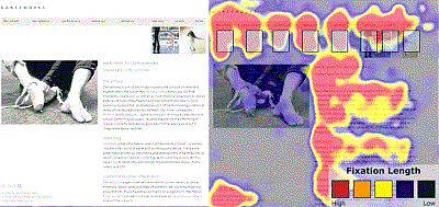
Have you ever noticed how some websites are just easier to read than others? The New York Times comes to mind as a good example of a site that creates an enjoyable experience through its use of columns that are not too wide, tight writing, lots of white space, and jettisoning unnecessary imagery.
The Online Journalism Review recently ran an extremely interesting article about the science of good page layout. It explains how using eye tracking software, it is possible to create more efficient pages that help uses read pages faster and retain more information at the same time.

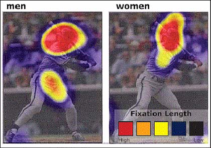
Among the different information that can be gleaned from eye tracking, I found the differences between the sexes eye moments to be the most interesting. (Though I will add, I’ve never found myself staring at other guy’s crotches — so that makes me wonder, is this for real?)

From the article:
Although both men and women look at the image of George Brett when directed to find out information about his sport and position, men tend to focus on private anatomy as well as the face. For the women, the face is the only place they viewed. Coyne adds that this difference doesn’t just occur with images of people. Men tend to fixate more on areas of private anatomy on animals as well, as evidenced when users were directed to browse the American Kennel Club site.
It would be interesting to delve a little deeper into this finding. If it is true, I imagine there may be some evolutionary reason for the differences.
(via Kottke)