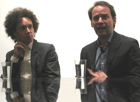
The Design Trust Council held their inaugural event last Wednesday in the Founders Room at the Museum of Modern Art in New York City.
Malcolm Gladwell (The Tipping Point, Blink) was joined by fellow New Yorker magazine writer Adam Gopnik(Through the Children’s Gate, Paris to the Moon), in an entertaining and provocative conversation titled “Gothamitis.”
Gladwell and Gopnik, both keen observers of New York civic life, each relate different perspectives on “Gothamitis” what current development trends mean for the soul of New York City.
Listen to the entire conversation (116.5mb mp3), along with audience questions via Design Trust’s blog, I ♥ Public Space.
Email me if you’d like a copy of the mp3, I still have a copy on my old hard drive
The American version of Deal or No Deal is airing its 100th episode. When I first watched the show, sometime close to it’s premiere, I was quite bothered by the fact that the game doesn’t really have much strategy to it. You don’t have to know anything, you just pick random cases—something that anybody could do.
Nevertheless, despite the aggravating stalling and the fact that I judged most of the contestants to be greedy morons, I found myself compelled to watch, at least for the first few weeks—each episode hoping that tonight would be the night someone goes home a millionaire.
The greed aspect used to bother me because at a certain point the risk involved in continuing far outweighs the statistical chance of gaining more money. I suppose that’s what makes the show so compelling and I have to admit that within every negotiation, there is a time to get out and a time to stay in, and success hinges upon selecting that sweet spot between too early and too late. I tend to admire those with the sense to get out early more than the romantics who go for it, because I’m not a high roller. Betting tens of thousands of dollars, even when the odds are on your side, is astonishingly reckless. I suppose though, either way it turns out, the suspense is very good for ratings and allows us at home to play vicariously—wondering what it is we would do when put in that same situation.
The following is a YouTube clip from British version of Deal or No Deal that aired last January. The host, or presenter, is a man named Noel Edmonds. The differs from the American version in that there are no lovely models to open cases. Instead they bring in 22 contestants and each choses a case at random. Then one person is selected to play the game and, like the American and Canadian versions, choses cases to open to eliminate from play.
It’ll all become clear in the clip but the main thing you need to know is that the folks opening the cases in lieu of the models are contestants who weren’t selected to play this round. Also, of course, the top prize is in pounds—it’s £250,000.
As of this morning the British pound was worth a hair under two bucks in American money so 250,000 of them is the equivalent of just under half a million US. If that seems horribly lower than the usual top prize in Canada and the States (a million dollars in our respective currencies), remember that on the North American shows, the top prize is in one out of 26 cases, not 22, so the odds are a little different.
Also note that, unlike the States, the winnings in the UK and Canada are tax free.
“I find the whole business of religion profoundly interesting. But it does mystify me that otherwise intelligent people take it seriously.”
-Douglas Adams
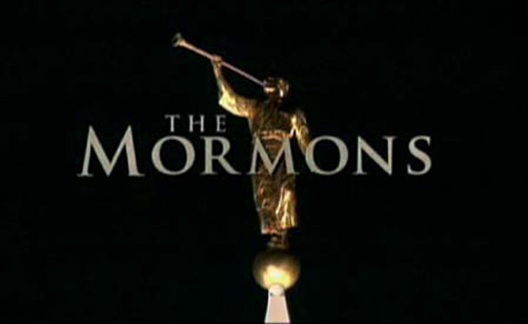
Twenty years ago today, I was baptized a member of the Church of Jesus Christ of Latter-Day Saints. That’s right, the Mormons. At this time, I won’t go into any detail how that’s worked out for me.
I will point out though, that a couple of days ago, the American channel PBS aired a documentary titled “The Mormons” which offers at least a relatively fair look at the church, its inspiring history and many of its blemishes. If you’ve ever wondered what the Mormons are all about, this documentary is a good place to start.
I believe the author and producer, Helen Whitney, tries to come off as impartial, however, she did make the impression to one of her interviewees that she really didn’t want to hear any negative comments about the church, even if they are true. In an off camera pre-interview he asked her, “If you love the church so much, why don’t you join it?” She responded, “well maybe if I were younger.” It gives cause to wonder at her true impartiality.
Still the documentary will probably show you whatever you are looking to find, whether it’s support for the church or evidence that Joseph Smith was a con man who was so convincing that he even had himself fooled.
The Disneyland Resort Paris music site is offering used to offer free downloads of music from the park. The songs are available for two weeks and then rotated.
I’ll be interested if they offer any music from the attractions themselves or just area music. A while ago I started searching for some Pirates of the Caribbean music, but so far my search has been unsuccessful. Hopefully I’ll be able to find it here. (Yup, I got them)
Remember that you’ll have to unzip the files and enter the password they give you (www.dlrpmusic.com) but the downloads are free. You can also find more downloads in the bonus section.
Oh, and a word of warning, they have background music that plays automatically, ala webdesign 1996, but at least there is a stop button to turn it off.
(Leave me a comment if you’re looking for these files, I might still have a copy somewhere)
Coming around this corner I saw a ball crossing and I saw this kid running across the street for the ball. I saw my truck was coming so I dab my buddy off the bike push the kid out of the way and my leg burst as he rode by me.
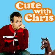
In a vain attempt to keep up with youth culture, I checked out the Cute with Chris show.
I’ve heard it described as Canada’s answer to Ze Frank (Chris lives in L.A. but is from Canada). I have to say, he’s no Ze however I will admit his show is kind of “cute” in a silly sort of way. Your mileage may vary.
I began to pre-slice bananas and give them to people I knew. Even when you know how it is done, peeling open a banana to reveal those perfect slices transforms the mundane banana-peeling experience. The service provided by pre-slicing a banana is a small (and unnecessary) one, but pre-slicing magnifies the effect of the gift. The recipient not only gets a banana, they get the unexpected.
This is about ten years old, but I just discovered it recently and think it applies pretty much perfectly to a conversation I had only a week ago. Yes, as hard as it is to believe, there are still people who refuse to accept evolution as “science”.
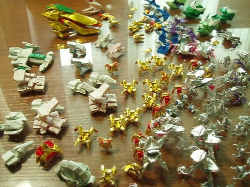
A flickr user going by the name gluek has some amazing photos of Starcraft themed origami. As a former Starcraft addict, I have to say, the attention to detail is unreal.
 In a vain attempt to keep up with youth culture, I checked out the