Categories
technology

First-Person Hyperlapse Videos

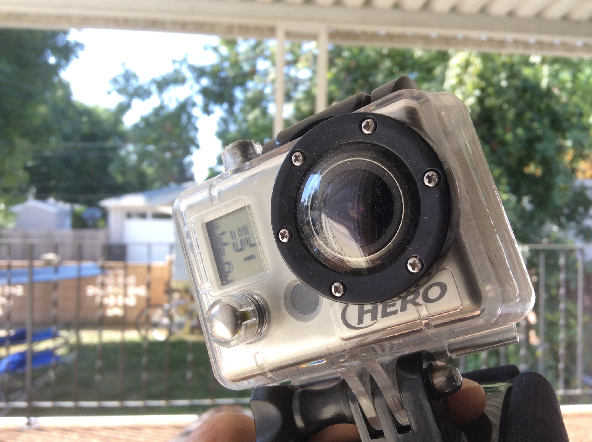
At this year’s SIGGRAPH conference, Microsoft Research presented their First-Person Hyperlapse Videos. These videos are compiled of rendered hybrid frames from shaky head-cam footage turned into amazing time-lapse videos that flow smoothly. The dramatic improvement between the before and after is astounding.

We present a method for converting first-person videos, for example, captured with a helmet camera during activities such as rock climbing or bicycling, into hyperlapse videos: time-lapse videos with a smoothly moving camera.

They say they are working hard on making their Hyperlapse algorithm available as a Windows app.

Awesome.
Categories
Photography

TED Talk by Blaise Aguera y Arcas

What you are about to watch is truly remarkable, and it just gets better as it goes.

Using photos of oft-snapped subjects (like Notre Dame) scraped from [Flickr], Photosynth (based on Seadragon technology) creates breathtaking multidimensional spaces with zoom and navigation features that outstrip all expectation. Its architect, Blaise Aguera y Arcas, shows it off in this standing-ovation demo.

See more on Seadragon and Photosynth.

Categories
typography

Microsoft Office Compatibility Pack

The 2007 version of Microsoft’s Office Suite supports new file formats and new fonts that won’t work on older versions without a compatibility upgrade.

Users of the Office Suite can check out Microsoft Office Compatibility Pack for Word, Excel, and PowerPoint 2007 File Formats. Just download O2007Cnv.exe in the language of your choice and install. Your system will be updated to allow backwards compatibility with files saved from the newer versions and even if you don’t have MS Office, you will be pleased to note that this .exe will also automatically install Microsoft’s new Vista fonts including Calibri which is slated to replace Times New Roman.

I question the logic behind replacing the most ubiquitous serif font set of the past 10 years, Times New Roman, with a sans-serif font, Calibri. While sans-serif fonts are known to be easier to read on screen, it seems to me that most of the things people type in word processors are going to be printed anyway.

Having said that, I still like the new fonts.