The new fonts included with Windows Vista are called Calibri, Cambria, Candara, Consolas, Constantia, and Corbel, and even though you don’t have Vista you know you want them.
These are the new and improved fully finished versions. Update (March 31, 2008) If you want an official source for the fonts install PowerPoint Viewer 2007. The fonts will be automatically added to your Windows system. (Disclaimer: Read the legal fine print on Microsoft’s site for usage rights.)
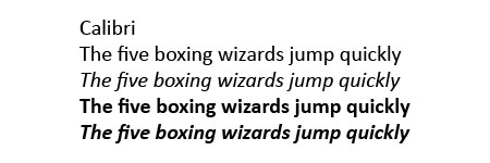
Wikipedia entry on Calibri.
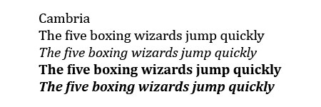
Wikipedia entry on Cambria.
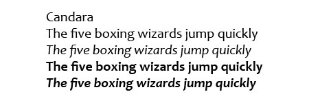
Wikipedia entry on Candara.
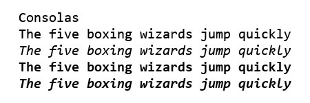
Wikipedia entry on Consolas.
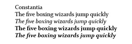
Wikipedia entry on Constantia.
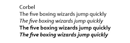
Wikipedia entry on Corbel.
Previously: Windows Vista Fonts Now Available and Microsoft Office Compatibility Pack.
I love the new fonts and use them when I can. In fact, I switch Firefox to display Calibri as my default font on my home computer, and switched the settings so my default font overrides those set by site stylesheets.
It might just be me, but even using Times New Roman on Vista, my documents come out much clearer than usual. Don’t know how or why, but I’ll take it.
Jeff, you are the man. Now I can at least see what Vista users will be seeing on my site. I noticed something interesting, though. On a Mac, these fonts all look small. Then I realized that if my ppi was 96 instead of 72, they looked about right. So maybe MS is also trying to make sites read at the same size across platforms? Good for them, if so…
Thanks!!
How do you make these the default system fonts? (Sorry, noob.)
Thanks a lot for the fonts! Will be nice to use them on Old Tiger thanks to you!
Muchas gracias por la recopilacion.
A pity they do not contain the IPA extensions. As a linguist I am in need of a monospaced font with IPA signs.
This is just sweeet!!!!! Thank you soooo much for the effort!
thanks a lot
thanks a lot
thks for this bro, gretings from mexico!!!
Thank you
Hiiii!
xdd
How can I download this??
Click on the images above and unzip the files.
Merci Beaucoup!
Thanks a lot!!!
graciass
graaaciasss
Gracias.
Muy buen artÃculo. Muy buen sitio, suerte!