Over the years I’ve written a bunch about Microsoft fonts. Specifically my posts about Vista Fonts have long been pulling in random visitors. So I figure I should write about their new fonts:
The five new fonts that Microsoft are proposing as a new default are:
- Tenorite – by Erin McLaughlin and Wei Huang
- Bierstadt – by Steve Matteson
- Skeena – by John Hudson and Paul Hanslow
- Seaford – by Tobias Frere-Jones, Nina Stössinger, and Fred Shallcrass
- Grandview – by Aaron Bell
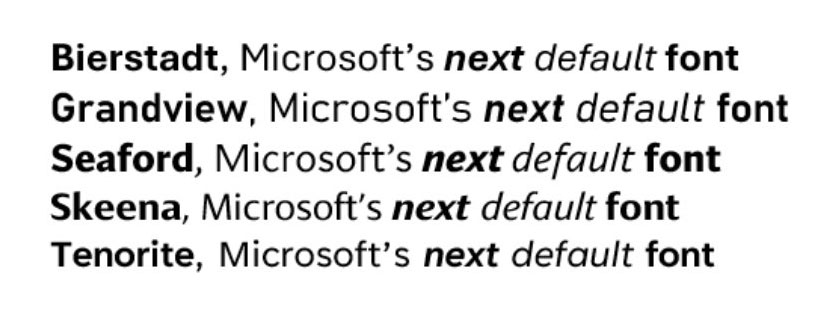
After going back and forth about my favourite, I think Tenorite would be my choice for the new default font. I like the single story a and g as well it’s slightly wider than my next favourite typefaces. I like geometric simplicity with the q being basically circular and the lowercase L having the form of just a straight line.
I was thinking about this and wondering: why hasn’t Microsoft moved forward with picking their new default. The blog post pumping up the idea was posted 17 months ago. They said the change would happen in 2022 and that it would “be evaluating these five directions over the next few months” which, I guess means there is still time but something is amiss.