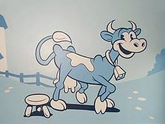
Cartoon film collector Joe Busam recently posted a slide show of his progress painting a nursery, in the style of a generic early-1930s cartoon, for his soon to be born grandson.
I think it looks really cool! When I worked at the YMCA swimming pool I’d spend a lot of my time thinking about how great it would be to create a masterpiece mural for their wall. (Hey, I can think about artwork and make sure people don’t run at the same time).
Joe gave Cartoon Brew the backstory on this home project:
When daughter Susi asked me to paint a mural for the nursery, she requested 1930s cartoon characters. Specifically she wanted the style of the Harman & Ising WB cartoons. We both have always love them for their style and unique energy. However she didn’t want recognizable characters. Once we established a theme I went to work researching the cartoons for barnyard animals. I then put together the farm kids who are actually the two main characters from Pagan Moon in disguise. Originally the colour scheme was going to be based on two strip Technicolour. As it turns out Susi liked the original B&W layouts so much that when I added colour it seemed anti climatic to her. Full spectrum colour turned out to be too much. In desperation, I added a tint to the original B&W art and that clicked with both of us. Now that I see it enlarged on the wall I think it was a wise choice. More colours would have been pretty overpowering.
Check out the collection of images of Joe Busam’s 1930’s Style Cartoon Mural.
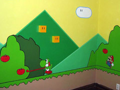
Another fantastic mural I came across lately is this Super Mario World creation that includes green pipes affixed to the walls and ceiling and other Marioworld objects that add dimension.
This is pretty cool whether or not you are a fan of the game.
And to wrap up this post on murals, check out Lindsay’s Satellite Map Mural, a neat “reverse” going-away present by a young artist that wanted to leave something behind for her friends to remember her by.
One of the interesting decisions Lindsay made was how to orient the map on the wall. Instead of doing it with North facing up, she [put] South at the top. At first this is highly disorienting because of how accustomed we are to looking at maps North-up. But then, once you realize that up on the map is the direction you’re facing, everything seems to fall into place.
It’s neat stuff, and it’s got me thinking about a future mural project of my own.