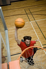
 By way of a little self indulgence, here is a photo my brother took of me dunking the basketball last weekend. Does my long hair and beard remind anyone else of Teen Wolf?
Knitted Animation Music Video
This amazing music video by Director Simon Laganière, for the Quebec duo Tricot Machine, uses artwork of entirely knitted yarn to animate each frame. (A tricot is a plain, warp-knitted cloth of any of various yarns.)
Over 700 unique knitted pieces were created for the video by designer Lysanne Latulippe of the fashion label Majolie.
(via)
Patrick Stewart on The Extras
I just came across this clip of Patrick Stewart on The Extras. This is an old one that you may have seen before, but it’s a classic.
[Patrick Stewart on Extras – YouTube]
Oscar Nominated Animated Shorts for 2008
The Oscar nominations for the 80th annual Academy Awards were released yesterday. The nominations in the class of Best Animated Short Film are:
- I Met The Walrus (Josh Raskin) View
- Madame Tutli-Putli (NFB, Chris Lavis and Maciek Szczerbowski) View
- Meme Les Pigeons Vont Au Paradis (Even Pigeons Go To Heaven) (Samuel Tourneux and Simon Vanesse) View
- My Love (Moya Lyubov) (Alexander Petrov) Part one, part two, part three
- Peter And The Wolf (Suzie Templeton and Hugh Welchman) View DIVX version.
(via)
Learning to Play the Guitar in the 21st Century
In answer to the age of question of “What would you like for Christmas”, I told my parents I would be interested in having a guitar. A couple of Christmas’s later, my parents came through for me! I am now the proud owner of a fantastic sounding Fender acoustic guitar.
Learning to play has been slow but rewarding. The first couple of days were painful on my fingertips. Then suddenly, after a blister or two, I can now play for as long as I like.
It’s great.
Really.
The guitar I picked out came as a package along with extra strings, a strap, some picks, a tuner, and a “Getting Started on Guitar” DVD.
I was surprised to find how easy and useful the DVD turned out to be. The host teaches you how to play a basic chord and then another track lets you play along to some canned backup music. The process repeats, slowly building up your skill.
It’s pretty sweet; my only complaint is that after the music stops, you have to grab the remote and navigate back to the song to start it playing again. It would be nice to be able to set it to repeat, and to have more than 3 practice tracks.
Lately I discovered a method of practising that solves this problem.
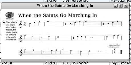
I got myself a copy of “Play Guitar Today! A Complete Guide to the Basics”. It’s a music book for beginners that has a CD enclosed for backup music. Well I ripped the CD to iTunes, scanned the music, and then set each track with it’s appropriate “album art” ie. the sheet music or instruction that fits.

Now when I practise the guitar, iTunes is the teacher. The corresponding sheet music pops up and I can go to town.
It was a bit of a hassle setting this up, but I’d recommend it to anyone learning to play—it’s totally worth it.
I wonder how long it will be until they sell it like this?
Time’s The Year in Images
The best images of 2007 as picked out by Time. (Someone needs to teach the time.com web developers the magic of AJAX).
Heraldic Brush Set
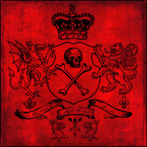
The other day I came across a neat collection of “Heraldry Brushes” by MrTentacleGuy on deviantART. I was disappointed to find out that the brushes were actually in vector format and while great for resizing and maintaining their original integrity in Illustrator, not very handy for quick and dirty Photoshop work where a brush set (.abr) is all you really want.
So I took his heraldry vector collection and made it into a brush set. I’m releasing it under the same Creative Commons Attribution 3.0 License. Here is a little sample I threw together using the new brushes (sorry the red background is not part of the set).

Download the Heraldic Brush Set (.zip)
There are over 70 high resolution brushes in this set! If you use it, please leave a comment and don’t hesitate to link back to your work as well.
From Wednesday’s Photoshoot
Man & Beast
 There is a new play opening at the U of L on Thursday. It’s a bit out there for my usual theatrical consumption, however, I think sometimes it’s good to challenge yourself and can you really go wrong with a play about sex?
Director Ben Hart gave me a ticket to see this show, so I guess I’ll find out on Thursday.
Continue reading “Man & Beast”
Viva Las Vegas
I realize it has been a long time since I’ve posted anything here, but I’ve been busy!
Most recently I’ve found myself down in Mesquite, Nevada getting ready to watch my brother-in-law compete in the World Long Driving Competition.
Today my family and I drove to Las Vegas to take in the sights and sounds of the notorious city. I’d share everything that I did, but you know what they say about what happens in Vegas.
If you’re so inclined, you can check out and comment on some of my flickr photos from today’s travels.
Continue reading “Viva Las Vegas”


