I did a bit of sketching with charcoal for a drawing class in University. One of the projects I did involved drawing something, erasing it and redrawing the same thing after some action had happened.
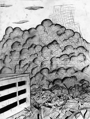 Because charcoal leaves marks behind after it’s erased, the original action could be seen behind the new drawing. I repeated these steps about 5 or 6 times. To the left is my artwork (click to view bigger).
It was a lot of work for, what I consider to be, not a great payoff. I like to think that the work has some good conceptual value, even if it’s not that interesting to look at.
The following is a truly amazing wall animation that works on the same principle. (It would have been smart of me to document each step of the process in photographs too).
Realizing how much work went into the poster sized effort I created in University, I’m blown away by the amount of time and effort that it must have taken to create this video. Not only is each individual frame beautifully crafted but the animation is also wonderful. Please enjoy, Fantoche:
[Fantoche – YouTube]