Microsoft Picks A new a Default

Microsoft announced they finally picked a new default font for Office:

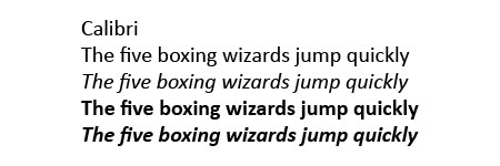
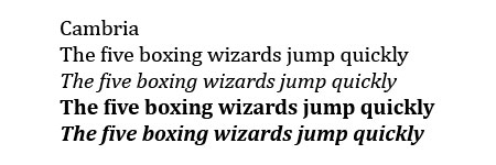
For 15 years, our beloved Calibri was Microsoft’s default font and crown keeper of office communications, but as you know, our relationship has come to a natural end. We changed. The technology we use every day has changed. And so, our search of the perfect font for higher resolution screens began. The font needed to have sharpness, uniformity, and be great for display type. It was exciting at times, but also intimidating. How do you replace Calibri? How do you find that one true font that can take its place as the rightful default?

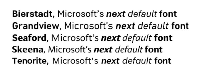
As we shared before, Microsoft commissioned five new fonts: Bierstadt, Grandview, Seaford, Skeena, and Tenorite. It was our hope that one of them would be our next default font for Microsoft 365. All of them were added to the drop-down font picker. From there, as you got a chance to use them, we listened to your impassioned feedback and chose the one that resonated most which was Bierstadt. But as there was a change of guard so too the name. Bierstadt is now known as Aptos.

I had previously decided I liked Tenorite best. There are some odd things about this unveiling though, unfortunately I don’t have the answers. Why did it take them this long to make these fonts the default? It’s also odd that they chose Aptos (née Bierstadt) based on customer feedback. It’s also weird that there is a lack of examples of these typefaces at normal sizes in any of the marketing material which, in the context of Office documents, the real importance lies in their appearance at document text sizes, even though they’ve primarily been showcased at larger display sizes.

Microsoft’s Next Default Font

Over the years I’ve written a bunch about Microsoft fonts. Specifically my posts about Vista Fonts have long been pulling in random visitors. So I figure I should write about their new fonts:

The five new fonts that Microsoft are proposing as a new default are:

  • Tenorite – by Erin McLaughlin and Wei Huang
  • Bierstadt – by Steve Matteson
  • Skeena – by John Hudson and Paul Hanslow
  • Seaford – by Tobias Frere-Jones, Nina Stössinger, and Fred Shallcrass
  • Grandview – by Aaron Bell

After going back and forth about my favourite, I think Tenorite would be my choice for the new default font. I like the single story a and g as well it’s slightly wider than my next favourite typefaces. I like geometric simplicity with the q being basically circular and the lowercase L having the form of just a straight line.

I was thinking about this and wondering: why hasn’t Microsoft moved forward with picking their new default. The blog post pumping up the idea was posted 17 months ago. They said the change would happen in 2022 and that it would “be evaluating these five directions over the next few months” which, I guess means there is still time but something is amiss.

What are the Fonts Included with the Adobe Typekit Free Plan

One of the great things about an Adobe Creative Cloud subscription is that it comes with a basic “free” TypeKit plan which gives one access to 280 font variations (20 at any one time). Something that is not so great is that there is no obvious way to find out which fonts are included without swimming through the thousands of possible font choices that are not included in the basic free typekit plan.

Recently I came across a lesson on Lynda.com that shared all of the fonts in the free plan and I’ve updated the list and made it into a .pdf to share — Fonts Included with the Adobe TypeKit Free Plan.

Enjoy!

Updated version August 2018.

Update: Interestingly, I discovered that while difficult to make a file with all of the 280 free fonts in the same document, once I exported the finished document, I was able to sync all the fonts and leave them activated.

Vista Fonts

The new fonts included with Windows Vista are called Calibri, Cambria, Candara, Consolas, Constantia, and Corbel, and even though you don’t have Vista you know you want them.

These are the new and improved fully finished versions. Update (March 31, 2008) If you want an official source for the fonts install PowerPoint Viewer 2007. The fonts will be automatically added to your Windows system. (Disclaimer: Read the legal fine print on Microsoft’s site for usage rights.)

Calibri.jpg font sample
Wikipedia entry on Calibri.

Cambria font sample
Wikipedia entry on Cambria.

Candara font sample
Wikipedia entry on Candara.

Consolas font sample
Wikipedia entry on Consolas.

Constantia font sample
Wikipedia entry on Constantia.

Corbel font sample
Wikipedia entry on Corbel.

Previously: Windows Vista Fonts Now Available and Microsoft Office Compatibility Pack.

Typographics

Ryan Uhrich, an artist living in Edmonton, AB has created a wonderful motion graphics piece called Typographics (19mb Quicktime).

Typography Motion Graphics

I love watching this kind of thing and wish I was more experienced with compositing.

Say What Again

I’m a typographic artwork fan, a Quintin Tarrentino movie fan, and I really like motion graphic compositing projects, so, when I saw Jarratt Moody’s time-based typography assignment (at SCAD) based on Samual L. Jackson’s “Say What Again” dialogue from Pulp Fiction, I figured I couldn’t pass up the chance to share this:

The basic idea of the project is to take a piece of audio from wherever (movie, song, poetry reading, answering machine) and then represent that audio on screen using only typography.

Jarratt chose a famous bit of dialogue from Pulp Fiction as his subject matter. (Okay, what dialogue from Pulp Fiction isn’t famous?) The resulting piece is full of whimsy and style. Jarratt does some great things with scale and simple but effective camera movements. Get those headphones on and prepare yourself for several lashings of Samuel L. Jackson’s naughty tongue.

Say What Again by Jarratt Moody

Watch the piece | Visit Jarratt’s Site

Microsoft Office Compatibility Pack

Office logo and icons

The 2007 version of Microsoft’s Office Suite supports new file formats and new fonts that won’t work on older versions without a compatibility upgrade.

Users of the Office Suite can check out Microsoft Office Compatibility Pack for Word, Excel, and PowerPoint 2007 File Formats. Just download O2007Cnv.exe in the language of your choice and install. Your system will be updated to allow backwards compatibility with files saved from the newer versions and even if you don’t have MS Office, you will be pleased to note that this .exe will also automatically install Microsoft’s new Vista fonts including Calibri which is slated to replace Times New Roman.

I question the logic behind replacing the most ubiquitous serif font set of the past 10 years, Times New Roman, with a sans-serif font, Calibri. While sans-serif fonts are known to be easier to read on screen, it seems to me that most of the things people type in word processors are going to be printed anyway.

Having said that, I still like the new fonts.

CAPSoff

WHO ACTUALLY USES THE CAPS LOCK KEY ANYWAY? Oops, I mean who actually uses the caps lock key anyway? People who like to shout, that’s who. But having spent upwards of 3 minutes contemplating the usefulness of the caps lock key, I for one agree, it’s time to do away with caps lock.

I should also mention that it’s high time we get rid of comic sans and while we’re at it let’s give the planet Pluto a demotion. Can you hear me? DEMOTE PLUTO NOW!

Upon further consideration caps lock is kind of handy for easy yelling. KNOW WHAT I MEAN?