“Great taste for beautiful people.” Check out this crazy Tab Cola ad from 1982. These were simpler times.
Hit play or watch TaB cola ad 1982 at YouTube.
A collection of digital wonders and some other stuff.
“Great taste for beautiful people.” Check out this crazy Tab Cola ad from 1982. These were simpler times.
Hit play or watch TaB cola ad 1982 at YouTube.
Greenpeace has launched a tongue-in-cheek website touting the tourism potential of the Alberta oil sands. The Greenpeace-produced site, travellingalberta.com, has an address similar to Alberta’s official tourism page, travelalberta.com, and is the conservation group’s response to the province’s $25-million campaign to improve the environmental image of Alberta’s energy industry.
[Explore Alberta – YouTube]
Minister of Tourism, Parks and Recreation Cindy Ady was not impressed with the website.
“I’m a bit disappointed mostly on behalf of those who work so hard in this industry, but I also would say it’s not an accurate representation of this province.”
 In his radio show, O’Reilly and the Age of Persuasion, Terry O’Reilly explores the countless ways marketers permeate your life—from art, media, and language, to politics, religion, and fashion—and he does it in a way that makes you crave episode after episode. You’ll never think about advertising the same way again.
I highly recommend you subscribe to the unofficial O’Reilly and the Age of Persuasion podcast.
Update: Check out my interview with Terry and Mike.
I don’t usually like to send on viral marketing links, it feels like I’m doing someone else’s job for them, but I liked the creativity used in this online store (not sure what language it’s written in). I think they actually sell everything you see. Here’s the link, and just to warn you, there is a bit of audio.
(via)
Last week I received an email touting the great benefits of a new kind of web advertising for eBay auctions, called “Auction Ads”. The email stated that just for signing up I’d get a bonus of $5 put into my account within two business days. Well four days passed with nothing, so I emailed them. They responded by saying it takes a week for the money to show up on my account. It has now been about a week and two days. I’ve given them over 24,000 ad views and they’ve given me nothing.

My advice: don’t waste your time with auction ads.
With a wide spread of PVR adoption comes a new form of “subliminal advertising”. Ads that last only 1 frame (that’s 1/24th of a second) probably aren’t able to influence viewers even subliminally, however, the following McDonald’s ad works because it is noticeable enough that someone watching on TV might pause, rewind, see the ad and then talk about it or better yet, post it on YouTube and create an instant viral ad.
(via)
I really like this animation that Honda used to announce their new diesel engines last year.

Check it out.
Updated with Youtube video:
Grrr, created by Weiden + Kennedy for Honda, is an animated 90-second film. Garrison Keiller sings a song with the lyrics ‘Hate something, change something, make something better’, and a new, silent and clean diesel engine is created. The ad ends with the flowers and trees forming the Honda logo and the words “Diesel i-CTDi”, and the screen fades to white and Honda’s “The Power of Dreams” tagline appears.
The ad was written by Kim Papworth, Richard Russell, Michael Russoff and Sean Thompson, won a number of awards including, Best Commercial Grand Award, Best TV Commercial Grand Award, Automotive Gold World Medal and Best Original Music/Lyrics Gold World Medal at the New York Festival 2006 The Winners.
I like the combination of new media skills that were used to create this interesting Toyota commercial.

Back in New York City for post production, the most interesting challenge was to design the type. We ended up designing just one custom-made alphabet for all the cars, but made all sorts of letter-like shapes for everything else. We made fun letters looking like buildings, trees, clouds, leaves and birds. We made letters carved into a cliff, and a flock of sheep forming a sentence. None of it could have been achieved with off-the-shelf fonts.
After watching the video, take a second to go back and pan through the video to see all the creative font placements. Also check out the this second ad in the series.
It’s not as memorable as their 1984 ad, but it’s still interesting—First iPod Television Ad:
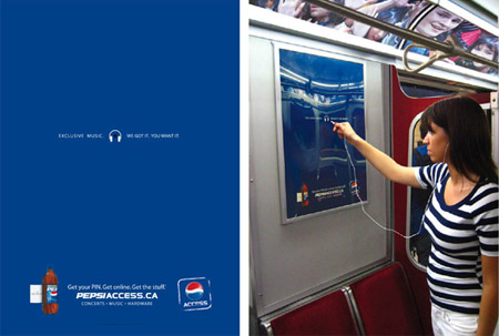
A new kind of interactive advertising allows consumers to plug their headphones into posters to get a short music sample. So if you’re mp3 playlist doesn’t happen to be doing it for you, you can check out what’s playing on the nearby posters. Right now they are promoting their Pepsi Access website. Seems like there is a lot of potential here—taking it one step further it would be a creative and extremely clever idea if the advertising firm teamed up with Apple and had an interface that you could, “park” your iPod on and download movie trailers, tv ads, or other advertising media that geeky consumers won’t be able to resist.

BBDO created a subway poster that has a fully functional headphone jack imbedded in it, which plays samples of various exclusive tracks available at pepsiaccess.ca. There are close to 100 posters playing 12 different tracks running in Toronto and Vancouver from now until the end of summer.

Pepsi’s got the right idea here. It seems to me to be a lot smarter than the Coke ads that continually scream “GOAAAAAAAAAAL” in celebration of the World Cup. I haven’t actually heard one of these myself but World Cup fan or not, it seems like it would get irritating pretty quickly.
(via)