I’m not a graphic designer but I that’s basically what the New Media program at the U of L taught me to be so I’m interested in good design and want to share some examples of recent logo and flag redesigns:
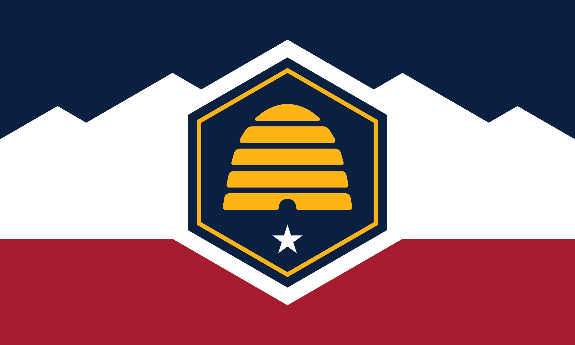
Back at the end of the 90s I spent a year living in Utah, the flag they had then is basically just the state seal on a blue background. Some 24 states still sport this style of seal on a blue “bedsheet”.
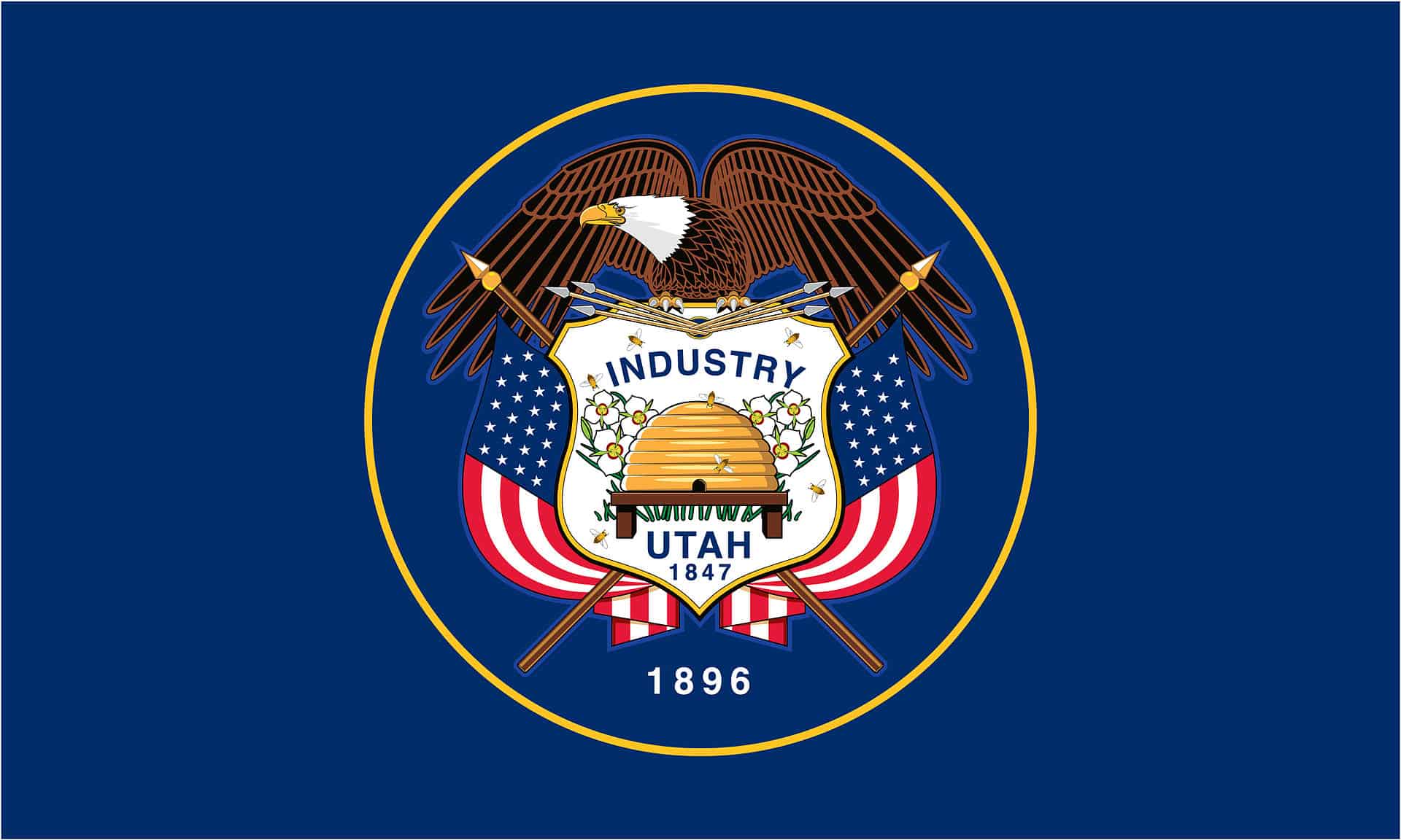
They’ve recently redesigned it and, in my opinion did a pretty good job. Modern design dictates that good logos should be simple enough that one could draw them from a basic description. The new flag meets that criteria. It’s got a great use of the beehive (a symbol of Deseret), the red rocks below, and the white peaks of the mountains. Good job.
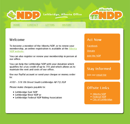
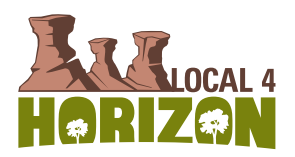
Speaking of redesigns, my ATA local recently updated their logo. When they were talking about doing the new logo I thought about volunteering to do it myself but I was worried that I wouldn’t create something in the same ballpark that a full time professional designer could come up with.
The new logo incorporates some symbolism of hoodoos (in the south) to the willow trees that exist in the northern part of our local. It doesn’t meet modern design’s trend of being easily drawn — it’s much too detailed.
I decided to make my own attempt and this is what I came up with:
![]() I suppose my design doesn’t pop in this black and white format, but I’m confident that adding a little colour would give it the same life as the one they chose. C’est la vie. Anyway, I’m disappointed that they’re not going to use my logo, I should have volunteered when the time was right.
I suppose my design doesn’t pop in this black and white format, but I’m confident that adding a little colour would give it the same life as the one they chose. C’est la vie. Anyway, I’m disappointed that they’re not going to use my logo, I should have volunteered when the time was right.
(via One Foot Tsunami)